A new think tank paper is out with a shocking, shocking I tell you, revelation that there is disinformation afoot. Mincemeat! I say old chaps, this ruse is a Haversack!
Now, before I get too snarky about this paper being disconnected from reality, I have to admit they did prove a small thing: if you ask a chatbot leading questions about made-up stories, it plays along about one time in six, and the junk sites may turn up in its citations.
That’s a finding.
I can work with that.
However, then these authors took a running leap off a cliff without a rope to claim Russia deliberately rigged websites so AI models would belch out the lies.
I mean, duh. The whole web history has been astroturfing and sock puppets, and Russian history has been militarized disinformation for over a century (copying the Americans and British), so put that all together and what do you expect? But that’s the exact problem here. Our expectations aren’t a substitution for science.
Their test can’t tell their explanation apart from a boring one: models remembered the junk from training. They never checked which it really is, so reading the paper is very disappointing.
The one in six math also is familiar. NewsGuard in May 2025 tested Australian election falsehoods with its innocent, leading and malign prompt styles and also got 16.6 percent. A different country and different topic hit that same number, which suggests the test design may be at fault.
Even more troubling is the fact that their website “evidence” of bad intentions is simply what a standard WordPress plugin does on its own. Let me explain. This report says the max-snippet:-1 directive is a strong signal of deliberate targeting.
Well, it is also found in the page source of the think tank’s own release page, and on the Euronews article that launched the report. Anyone can view the source and check. Are they not aware of their own site undermining their main claim?
And every one of the questions used came from the research team itself? Is that any different from what the authors are accusing the Russians of doing? Is this paper now not evidence of British information dissemination? The researchers typed the questions, and then just reported the answers as a public threat without proper checks. I’m not sure why.
The necessary checks are easy, and yet they skipped them. As a matter of fact, they already were published by someone else. Four researchers at Manchester and Bern (Maxim Alyukov, Mykola Makhortykh, Alexandr Voronovici and Maryna Sydorova) tested the earlier NewsGuard claim in the Harvard Kennedy School Misinformation Review last October. Their echo rate was 5 percent instead of 33. Junk citations appeared in 8 percent of answers, usually with warnings attached, and almost entirely when a prompt matched stories that appeared solely on the junk network.
They concluded the cause was data voids: models pull from junk when better coverage is thin. They also noted NewsGuard published no prompt set and counted cautious answers as failures.
Their own analysis in Al Jazeera has perhaps said it best: a study built to find disinformation has found it. Swiss reporters at NZZ got NewsGuard to confirm that its prompts were written so the chatbot only had to agree with the falsehood in the question, and NewsGuard declined to release the full prompt list. The same researchers also made the point that Margarita Simonyan cites Western research as proof that RT works, rather than citing actual proof that RT works.
So this paper says to me the think tank started out to prove a hypothesis “Russia did this” and then wrote everything down as proof. Tests that could have disproved it don’t appear to have been tried. And that means they launched an unproven conclusion.
Far worse, they are gifting the Russians a huge boost. Why? These horrible spammers’ whole existence is convincing the world their junk works. A British report saying “the junk works” is just an ad for the junk sellers.
This report was funded by whom exactly?
Will Perrin, co-architect of the Online Safety Act’s duty of care. He is funding the paper that argues platform regulation should now extend to LLMs.
He built the regulator, then he wrote its doctrine, then he ran its lobby, and now he pays for the synthetic laundering, a paper with unproven claims about Russian disinformation, to push state censorship.
Oh, and the report he funded calls for “black-lists”, in 2026. Racist language, on top of it all, in a report complaining about “bad” information spread! Such fools. The UK’s National Cyber Security Centre retired that term in 2020, and the Home Office has followed. I’ll tell you who needs a block list.
Menschen, die am 25. Juli 2026 gegen 22:00 Uhr den 48. Christopher Street Day verließen, wurden von einem weißen Transporter angegriffen, der in den Großen Tiergarten in Berlin einfuhr und tief in die Mitte des Parks vordrang, über einen Fußweg, den Ahornsteig, nahe der Lennéstraße am Potsdamer Platz, Menschen auf seinem Weg erfasste und schließlich gegen einen Baum prallte. Eine Frau starb noch am Tatort.
Der weiße Citroën an dem Baum, an dem seine Fahrt über den Ahornsteig endete.
Die gemeinsame Mitteilung von Polizei Berlin und Generalstaatsanwaltschaft verzeichnet weitere Verletzungen durch das Fahrzeug und durch Stichwerkzeuge. Über das Ausmaß der Schäden herrscht weiterhin Uneinigkeit: Bundesinnenminister Alexander Dobrindt sprach von neunundzwanzig Verletzten, die Feuerwehr zählte drei lebensgefährlich, acht schwer und fünf leicht Verletzte. Tatortfotos zeigen einen weißen Citroën mit Transporterkarosserie und Berliner Kennzeichen, ein Pkw nach Zulassung und ein Transporter nach Bauform; die Polizei spricht von einem Privatfahrzeug, entgegen frühen Berichten über einen Mietwagen. Es wurde am Tatort zurückgelassen, der Verdächtige mit einer Stichwaffe auf der Flucht, nachdem er zu Fuß auf Menschen losgegangen war, sein Telefon noch im Wagen. In der Nacht nahm die Polizei einen zweiten Mann fest, den sie als mutmaßlichen Beifahrer bezeichnet.
Digitale Werbetafel in Berlin mit dem Fahndungsaufruf der Polizei.
Der Ort des Anschlags ist eindeutig. Der Transporter fuhr tief in den Park hinein, über einen breiten Weg, außerhalb des Demonstrationsgeländes, nach dem Ende der Demonstration, während die Menge noch in der Nacht feierte. 22:00 Uhr nach dem offiziellen CSD-Programm bedeutet nahezu maximale Dichte für die nächtlichen Feierlichkeiten.
Mitte des sehr großen Berliner Tiergartens, durch den ein großer weißer Transporter bei einem Terroranschlag fuhr.
Der CSD Berlin ist eine angemeldete Versammlung. Der Berliner CSD e.V. meldet ihn jährlich an, unter Artikel 8 des Grundgesetzes, und Berlin weist den Schutz von Versammlungen seiner Polizei zu. Brokdorf (BVerfG, 1 BvR 233/81) verpflichtet den Staat, eine Versammlung vor Angriffen von außen zu schützen.
Das CSD-Veranstaltungsgelände selbst lag innerhalb eines polizeilichen Sperrkonzepts unter Polizeipräsidentin Barbara Slowik Meisel, und dieses Konzept hielt. Der vom Angreifer genutzte Ahornsteig liegt außerhalb davon, ein Weg in einer Grünanlage, unterhalten vom Straßen- und Grünflächenamt des Bezirksamts Mitte im Geschäftsbereich von Stadtrat Christopher Schriner. Das für den Park zuständige Amt sitzt in der Straße des 17. Juni 31, mitten im Park. Seine Lastwagen benutzen die Wege. Die Zufahrten, die der Angreifer ausnutzte, sind für die Unterhaltung gebaut, und offenbar unbewacht, trotz des hohen Risikos für genau die Art von Anschlag, für deren Nichtverhinderung Deutschland bekannt geworden ist.
Die Zuständigkeit für die Verwundbarkeit dieser Zufahrten wurde am 11. Dezember 2025 festgeschrieben. Die Senatsverwaltung für Inneres und Sport beantwortete die Schriftliche Anfrage 19/24467 zu Fahrzeugsperren an Weihnachtsmärkten, derselben Bedrohungsklasse wie der CSD. Auf die Frage, ob Zufahrtsschutz zur Terrorabwehr, zur allgemeinen Gefahrenabwehr oder zur zivilrechtlichen Verkehrssicherungspflicht des Veranstalters gehört, antwortete die Verwaltung von Senatorin Iris Spranger, unterzeichnet von Staatssekretär Christian Hochgrebe:
Eine von den Umständen des jeweiligen Einzelfalls losgelöste allgemeingültige Abgrenzung ist nicht möglich.
Das Dokument verteilt die Zuständigkeiten. Veranstalter privater Veranstaltungen tragen die zivilrechtliche Verkehrssicherungspflicht für das Veranstaltungsgelände. Alles darüber hinaus fällt an das Bezirksamt als Ordnungsbehörde. Die Polizei berät, entscheidet nichts, und trägt, in den Worten des Senats, weder Zuständigkeit noch Verpflichtung zur Errichtung von Fahrzeugsperren bei privaten Veranstaltungen, vorbehalten bleiben allein der Eilfall und die Ergänzung im Einzelfall.
Dieselben fünf Seiten datieren das maßgebliche Urteil (OVG 11 B 6.19) auf zwei verschiedene Daten: 6. August 2020 im zitierten Vorspann der Fragesteller, 15. Juni 2022 in der Antwort des Senats zu Frage sechs. Der Widerspruch ging unbereinigt in den Druck. Bei Versammlungen entfällt der Anteil des Veranstalters vollständig, weil das Versammlungsrecht verbietet, Menschen bei der Ausübung eines Grundrechts mit Schutzkosten zu belasten. Das Berliner Grünanlagengesetz, geändert 2024, knüpft Schutzpflichten in Grünanlagen an Sondernutzungsgenehmigungen (GVBl. 2024 S. 475, § 6 Abs. 5 S. 2). Eine abströmende Menge hat keine Genehmigung.
Boden
Zuständig
Instrument
Demonstrationsroute und Kundgebung, für deren Dauer
Polizei Berlin
Versammlungsrecht, polizeiliches Sperrkonzept
Veranstaltungsgelände bei privaten Veranstaltungen
Veranstalter
Zivilrechtliche Verkehrssicherungspflicht
Alles darüber hinaus, einschließlich Parkwege
Bezirksamt als Ordnungsbehörde
Allgemeine Gefahrenabwehr, Grünanlagengesetz
Die Doktrin
Senatsverwaltung für Inneres und Sport
Drucksache 19/24467: nur Einzelfall
Der Einsatz in der CSD-Nacht wird durch die eigenen Aussagen der Polizei geklärt. Sprecher Florian Nath sagte Reportern, 214 Okta-Betonblöcke und 40 weitere Zufahrtsschutzelemente hätten bewacht um das gesamte Veranstaltungsgelände gestanden, das Standardpaket, und ein Auffahren auf das Veranstaltungsgelände sei nicht möglich gewesen.
Auf das Veranstaltungsgelände. Man beachte dieses Detail.
Er verortete den Anschlag auf den Zugangswegen zwischen Lennéstraße und Ahornsteig, in der Nähe des Veranstaltungsgeländes.
In der Nähe des Veranstaltungsgeländes. Man beachte den Unterschied.
Der Regierende Bürgermeister Kai Wegner sagte dasselbe: außerhalb des gesicherten Bereichs. Beide Aussagen sind zutreffend, und zusammen erklären sie ein Versagen beim Schutz der Menschen, die die Veranstaltung besuchten. Die 254 Elemente umschlossen das Kundgebungsgelände in seiner formalen Definition. Damit gilt die Menge um 22:00 Uhr auf Fußwegen tief in einem Park als “außerhalb” des Veranstaltungsgeländes, obwohl der gesunde Menschenverstand sagt, dass genau dort zu dieser Zeit der plausibelste Ort für den CSD ist.
Die Lennéstraße verläuft offen entlang der Südkante des Parks, einen halben Kilometer, gesäumt von Zufahrten in der Größe von Unterhaltungsfahrzeugen. Die Westkante ist die Trasse der ehemaligen Entlastungsstraße über dem B96-Tunnel, ein befestigter Korridor, an beiden Enden offen, und die Mündung des Ahornsteigs öffnet sich an deren Kreuzung. Ein Augenzeuge sagte der AFP, der Transporter sei mit hoher Geschwindigkeit von der Lennéstraße abgebogen; die Polizei sagt, der Einfahrtspunkt sei nicht identifiziert und das Fahrzeug sei unbemerkt über teils unbeleuchtete Wege gekommen.
Auf die Frage, wie es durchkam, antwortete Nath: “Das fragen wir uns auch.” Keine Regel verlangte, dass die Sperren den Raum abdecken, den die Menge tatsächlich einnahm, also war niemand dafür verantwortlich zu prüfen, ob sie es taten. Die Standardmaßnahmen schützen das Auffahren auf das Veranstaltungsgelände und lassen die Menschenmengen in der Nähe des Veranstaltungsgeländes dem Angriff offen, obwohl sie tief in einem Park stehen, in den nachts kein Fahrzeug gehört.
Auch die Flucht des Fahrers verlangt eine Untersuchung. Er rannte in einen dunklen Park, der sich mit Tausenden füllte, die ebenfalls in alle Richtungen flohen. Die größte Polizeikonzentration des Jahres stand wenige hundert Meter entfernt, nach innen gerichtet. Früher am Tag hatte die Polizei genau beobachtet, was eine Menge sagte, doch mit einem Terroristen auf freiem Fuß erschlaffte die Polizei plötzlich. Es gab nach einem Terroranschlag keinen Kordon, in den er hätte hineinlaufen können, weil der Boden, den er überquerte, in niemandes Auftrag lag. Ein Ring um einen fliehenden Mann muss existieren, um ihn zu stoppen, doch die Polizei forderte dem Vernehmen nach alle zum Gehen auf, mit gegenteiliger Wirkung, was es unmöglich machte, ihn zu fassen. Wärmebildkameras über dem Tiergarten und die GSG 9 im Anhalter Bahnhof erbrachten zwanzig Stunden lang nichts. Wie die Polizei ihm auf die Spur kam, hat sie bislang nicht erklärt; laut einem Bild-Bericht war es ein Hinweis aus dem persönlichen Umfeld des Attentäters.
Als die Polizei den CSD beendete, wurde die Menge aus den Sperren hinaus auf Straßen und ungeschützte Wege geschickt. Der Transporter lag zerstört am Baum. Der Fahrer war mit einer Stichwaffe aus dem Wrack gestiegen, hatte Passanten angegriffen und war in der Dunkelheit verschwunden; ob sich ein zweiter Angreifer in der Menge bewegte, wusste zu dieser Stunde niemand. Die Entscheidung zur Auflösung fiel unter echter Unsicherheit. Eine Auflösung ohne Kontrollen war die falsche Antwort darauf.
Wer einen Bereich räumt, ohne die Ausgänge zu kontrollieren, kann niemanden mehr überprüfen, und an den Ausgängen stand keine einzige Kontrollstelle. Zehntausende strömten über genau die Art von Gelände ab, auf der der Anschlag gerade stattgefunden hatte, und derselbe Strom trug den Angreifer hinaus. Ob man das gesicherte Gelände hält oder räumt, ist eine Ermessensfrage unter Druck. Kontrollstellen an den Ausgängen dagegen sind Planung, die vorher vorliegen muss, und sie fehlten im Konzept genauso, wie der Ahornsteig im Sperrkonzept fehlte. Warum die Entscheidung so fiel, und welche Alternativen geprüft wurden, hat die Polizei bislang nicht erklärt. Ein Angriff, der auf eine Versammlung zielt und die Versammlung beendet, erreicht sein Ziel.
Früher am Tag lohnt ein starker Kontrast die Betrachtung. Ein paar Kilometer nördlich, bei der Internationalist Queer Pride, überwachte die Polizei sehr genau jede Bewegung und jedes Wort in einem Zug von 7.000 und nahm neun Personen fest, die meisten wegen Propagandadelikten im Zusammenhang mit der “River-to-the-Sea”-Parole; ein Jahr zuvor hatte die Behörde rund 1.300 Beamte auf die 10.000-Personen-Version desselben Zuges gesetzt. Die Parolendurchsetzung hat ein Gesetz, einen gerichtlich gepflegten Standard, zugeteilte Zuhörer und ein messbares Ergebnis bis zum Morgen. Der komplette Apparat sofortiger Bedrohungsbewertung existiert für Worte. Für einen riesigen weißen Transporter, der nachts durch einen Park fährt, zwei Tonnen bewegte Masse am Rand der größten Versammlung des Jahres, wirkte die Polizei unvorbereitet und ohne Wissen, wie die Öffentlichkeit zu schützen ist.
Die Lücke folgt aus zwei Planungsmethoden. Seit den Loveparade-Toten von Duisburg modelliert die deutsche Veranstaltungsplanung Menschenströme, damit Menschen schnell gehen und sich weit verteilen können. Die Sperrenplanung dagegen folgt dem Genehmigungsverfahren der Veranstaltung und dem Veranstaltungszeitplan. Der ungeschützte Raum ist die Differenz zwischen dem Modell menschlicher Bewegung und der Formalie einer Raumgenehmigung, und sie ist am größten beim Abströmen, wenn die Entfluchtungsplanung Menschen über viele Wege verteilt, genau in dem Moment, in dem der Sperrenplan abgebaut wird. Derzeit versöhnt kein deutsches Planungsdokument die Differenz zwischen Realität und Bürokratie.
Dasselbe Grenzversagen wiederholt sich in wechselnden Konfigurationen.
Datum
Ort
Gescheiterte Grenze
19. Dez. 2016
Berlin, Breitscheidplatz
Marktflanke ohne Sperren
7. Apr. 2018
Münster, Kiepenkerl-Terrasse
Dauerhafter öffentlicher Raum, keine Veranstaltungsgrenze vorhanden
1. Dez. 2020
Trier, Fußgängerzone
Dauerhafter öffentlicher Raum
20. Dez. 2024
Magdeburg, Weihnachtsmarkt
Für Rettungsfahrzeuge offen gehaltene Lücke im Sperrkonzept
13. Feb. 2025
München, ver.di-Zug
Bewegte Versammlung, Perimeter existierte nur, wo der Zug stand
3. Mär. 2025
Mannheim, Paradeplatz
Dauerhafter öffentlicher Raum
25. Jul. 2026
Berlin, Großer Tiergarten
Abströmbereich jenseits der Versammlungsgrenze, nach Ende der Versammlung
In drei der sieben Fälle stand der Fahrer bereits in staatlichen Gefährdungsakten, Breitscheidplatz, Magdeburg, der Tiergarten, und in jedem Fall änderte die Akte nichts. Die übrigen vier waren der Polizei höchstens aus dem Alltag bekannt, und das ist das Profil des impulsiven Täters, an dem jede Vorhersage scheitert.
Der Breitscheidplatz-Fahrer war ein registrierter Gefährder unter Beobachtung.
Der Magdeburger Fahrer hatte jahrelange Warnungen in der Akte.
Als Ballout den CSD angriff, war er bereits polizeibekannt, und seine Akte war, wie die von Amri, im Gemeinsamen Terrorismusabwehrzentrum behandelt worden, zuletzt in dessen Arbeitsgruppe für die höchsten Risikofälle.
Das Überwachungsargument sagt, immer mehr Wissen ermögliche das Abfangen: erkennen, entscheiden, unterbinden, die Kette geschlossen vor dem Kontakt. Die Überwachung lief bei Ballout auf Maximum und lieferte null Unterbindung. Die Kette riss am letzten Glied, und der Ausbau des ersten Glieds repariert nichts.
Ein Zwei-Tonnen-Transporter unter Fußgängern ist für jede Kamera und jeden Passanten sichtbar, und hier war der Zustand kein Augenblick, sondern eine Dauer, anhaltendes Fahren durch das Parkinnere, tief zwischen Menschen auf dem Heimweg, der Verstoß in ununterbrochener Existenz über die Länge der Fahrt. Wenn man einen riesigen weißen Transporter, der durch einen Park rast, nicht sofort identifizieren kann, dann ergibt der Ausbau detaillierter Überwachung mit hochentwickelten Markern überhaupt keinen Sinn.
Niemand war beauftragt, den Park um 22:00 Uhr zu beobachten, denn die 254 Elemente bewachten die Kante des Polygons, und das Parkinnere lag auf der anderen Seite, in einem Park, in dem nachts keine Autos hätten sein dürfen. Dies ist kein Moment für Scoring und Schlussfolgerung, denn die Antwort ist einfach. Fahrzeuge gehören nicht in den Raum von Menschenmengen, Rettung und Unterhaltung sind bekannte Ausnahmen, alles andere wird verweigert. Der berüchtigte schlichte weiße Transporter, der an jeder Allowlist scheitern würde, ist kein generisches Objekt, das auf Bewertung wartet. Er ist die Gefahr selbst, das Objekt, für das der Begriff Überfahrtat geprägt wurde.
Zwei Tonnen bei vierzehn Metern pro Sekunde zu stoppen verlangt Gegenmasse (Sperren), im Voraus platziert; keine Alarmierung ist schnell genug. Das deutsche Recht weiß das bereits und nimmt kinetische Energie ernst: Das Maschinensicherheitsrecht verlangt Schutzeinrichtungen zwischen bewegter Masse und Körpern, und das Eisenbahnkreuzungsgesetz schreibt Trennung vor, wo Schiene Straße kreuzt, mit gesetzlich geteilten Kosten (§ 13 EKrG). Niemand schlägt vor, Tote an Bahnübergängen durch bessere Lokführerregistrierung und detaillierte Überwachung zu verhindern.
Wenn der Sicherheitstest am sichtbarsten Objekt unter der einfachsten Regel zusammenbricht, wird das Argument für feinere Eingaben und teurere Überwachung nichts reparieren. Ein Gesicht auf fünfzig Meter oder ein Telefonstandort ist ein schwächeres Signal als ein weißer Transporter, der sich einer Menge nähert, und es speist denselben fehlenden Schritt.
Auch die Mathematik belegt den Punkt. Es gibt fünfzig Millionen zugelassene Autos in Deutschland und einstellige Angreiferzahlen pro Jahr, also überflutet die auf Einzelpersonen gerichtete Vorhersage ihre Betreiber mit Fehlalarmen, während die Klassenregel per Definition keinen Fahrzeugangreifer verfehlt. Sie deckt den Angriffsweg ab, der die Massenopfer verursacht. Das Messer nach dem Aufprall ist Sache der polizeilichen Reaktion, und die Massenschäden richtete der Transporter an.
Und die Vorhersage nimmt den falschen Angreifer an, einen Planer, der über Wochen Signale aussendet. Münsters Ermittler verwiesen auf dokumentierte psychische Probleme; in Trier drehte sich der Prozess um den Geisteszustand des Fahrers; Ballout ließ sein Telefon im verunfallten Transporter, versteckte sich zwanzig Stunden in einer Gartenlaube und rannte mit einem Messer auf bewaffnete Polizisten zu.
Die bisherige Aktenlage zeigt keine Tradecraft, die Nachrichtendienstler durchdringen könnten, und keine Planung jenseits der offensichtlichen Indikatoren, die die Deutschen für Ballout bereits hatten. Er war impulsiv. Er wollte einen Terrorakt begehen und einer Terrorgruppe beitreten. Ein impulsiver Angreifer heißt, die Vorhersage verliert sich in Bürokratie, während eine Sperre gegen hochwahrscheinliche und hochschwere Angriffe per Konstruktion verhindert.
Vielleicht wichtiger noch: Die teure, unpopuläre Vorhersageplattform rechtfertigt mit jedem Fehlschlag ihre eigene Ausweitung. Je weniger sie funktioniert, desto mehr beansprucht sie den Abbau von Widerstand. Das einfache Perimeterkonzept dagegen beendet das Problem und die Ausgaben zugleich. In jedem gelisteten Fall wurde das Risikosignal zu einem Bericht. Es führte nicht zu besseren Perimetern oder physischer Kontrolle, weil das eine Behörde verlangt hätte, der der Boden gehört, um sie dort aufzustellen und zu unterhalten. Für den Raum, den der CSD-Terrorist angriff, scheint keine solche Behörde zu existieren.
Das ist der Maßstab, den eine Antwort des Bundes verlangt, und der Hebel sitzt im Bundesrecht. Artikel 73 Absatz 1 Nummer 9a des Grundgesetzes weist dem Bund die Abwehr von Gefahren des internationalen Terrorismus durch das BKA zu, das BKAG setzt sie einfachgesetzlich um, und das GTAZ, in dem Ballouts Akte kursierte, sitzt unter dem Bundesinnenministerium. Die Zuständigkeit hat Dobrindt selbst reklamiert, als er am Tag nach dem Anschlag eine Überprüfung der Sicherheitskonzepte ankündigte. Wer die Überprüfung beansprucht, beansprucht den Maßstab. Die gesetzgeberische Bilanz seines Ministeriums in dieser Legislatur besteht aus Identifikations- und Analysebefugnissen: die Sicherheitspaket-Entwürfe für automatisierten Biometrieabgleich und zusammengeführte Analyseplattformen, ein Palantir-Einsatz des Bundes in Prüfung, und im Januar ein Vorstoß zur Aufweichung der EU-KI-Leitlinien, die genau diese Systeme beschränken.
Richtig gelesen. Palantir, das notorisch faschistische Unternehmen mit extremistischen Gründern, dessen deutsche Polizeieinsätze bereits ein Bundesverfassungsgerichtsurteil hervorbrachten, das ihre Rechtsgrundlage kippte (1 BvR 1547/19, 16. Februar 2023). Dobrindt redet vom Abbau rechtlicher Schutzvorkehrungen bei der Überwachung, während er mit Faschisten paktiert, was selbstverständlich nicht gut ausgehen wird, während das Fehlen physischer Schutzvorkehrungen am Boden selbstverständlich bereits nicht gut ausgegangen ist.
Nichts in der Bilanz des Ministeriums lässt erwarten, dass er besser darin wird, ein Fahrzeug von einer Menschenmenge fernzuhalten, obwohl das der bekannte und wiederkehrende Angriffsvektor ist.
Entweder fehlt den Behörden das Mandat, einen Perimeter um Menschenmengen durchzusetzen, was der Rechtszustand ist, den die Drucksache beschreibt, und dann liegt das Versagen bei den Ministern und Gesetzgebern, die das Mandat durch neun Jahre und sieben Anschläge ungeschrieben ließen. Oder das Mandat liegt im Ermessen, das die Behörden bereits nutzen, die 254 Sperrabschnitte belegen die Fähigkeit, und dann besteht das Versagen darin, dass niemand an Abdeckung gemessen wird, weil eine freiwillige Maßnahme kein Ziel hat, das man verfehlen könnte.
Nicht ermächtigt, oder nicht gemessen. Beides ist ein Versagen von Dobrindts Führung.
Beides gehört zu den Ämtern, die jetzt Überprüfungen ankündigen, und die Gefährdung dauert an. Wer ist zuständig für die Wege an der Lennéstraße, wenn es um einen Terroranschlag auf Zehntausende mitten in einem Park geht? Nach dem Tod des Verdächtigen sagte Dobrindt in der ARD, die Behörden gingen von keiner weiteren Gefährdung aus, und fügte im selben Atemzug hinzu: “Aber das ist alles immer eher eine Momentaufnahme.” Diese Einschätzung bezieht sich auf den getöteten Verdächtigen. Doch der Zustand, der sein Fahrzeug einließ, wie bei allen Fahrzeugangriffen vor ihm, scheint in Dobrindts Reden unverändert zu sitzen.
Diese Erklärung, es bestehe keine weitere Gefahr, braucht eine Grundlage, und eine Momentaufnahme räumt ein, dass sie keine hat. Ein Minister, der die Öffentlichkeit für sicher erklärt, ohne einen Maßstab, an dem Sicherheit zu messen wäre, berichtet keinen Zustand. Er fabriziert einen, auf einem unkontrollierbaren Niveau. Auch die Schuldzuweisung Dobrindts ist aktenkundig: Im ARD-Interview sagte er, er konzentriere sich auf die Frage, wie ein Gefährder eine Bewährungsstrafe erhalten kann. Wie ein riesiger Transporter mitten über einen Fußweg in einem Park fahren kann, erwähnte er nicht. Wegner zielte ebenfalls auf das falsche Ziel, mit “mir fehlen da schon die Worte”, mit Verweisen auf Haft, Abschiebehaft und Präventivgewahrsam plus IP-Speicherung und Überwachungsgesetzen.
Um es klar zu sagen, denn dies sind politische Aussagen ohne jeden Realitätsbezug: Abschiebehaft hat mit einem in Berlin geborenen Staatsbürger nichts zu tun. Die Überwachung des deutschen Mannes hätte nicht verfügbarer oder höher sein können. Er war bereits bekannt und verfolgt, was beweist, dass Überwachung nicht die Lösung ist.
Sicher, sie sagen, sie hätten Ballout in eine Zelle gesteckt, aber das Problem bleibt, dass die Zufahrt zum Ahornsteig für den nächsten Fahrer offen ist, einen von fünfzig Millionen, ob unter voller Überwachung oder nicht. Große Menschenmengen, die keinen Fahrzeugbedrohungen mehr ausgesetzt sind, sind die kostengünstigste Lösung für den absolut höchsten Sicherheitsgewinn.
Auch das Gerede über Zielpersonen weicht von dem ab, was durch Überwachung bekannt war. Das FBI warnte 2024 öffentlich vor Anschlägen auf Pride-Veranstaltungen. Jeder Sicherheitschef mit grundlegender Kompetenz hätte genau diese Bedrohung als hoch oder höchstwahrscheinlich eingestuft.
Im Mai 2025 wurde der Gelsenkirchener CSD Minuten vor Beginn abgesagt, wegen einer Drohung, die das LKA als ernst einstufte; im Februar 2026 wurde das islamistische Motiv bestätigt. Das angewandte Schutzmittel war die Absage, im Dienste der Angreifer. Das BKA-Register führt 420 islamistische Gefährder, und Ballout war darunter, auf der obersten Ebene des GTAZ.
Wenn also die Zielklasse der Überwachung im Voraus benannt war, und die exakte Einzelperson im Voraus benannt war, was würde noch mehr Überwachung erreichen? Nichts. Wenn die Sicherheitserklärung vom Sonntag gültig ist, lief die Fähigkeit dahinter schon vor dem Samstag und lieferte exakt null Schutz gegen den Transporter, der durch den Park fuhr.
Bis 2024 meldete die Programmliteratur die Aufträge der Gruppe als abgearbeitet und ihre Auflösung als vorgeschlagen; ob die IMK sie förmlich auflöste, ist im veröffentlichten Bestand nicht ersichtlich, der nur einen Teil der Beschlüsse freigibt.
Magdeburg folgte binnen Monaten, dann München, Mannheim, der Tiergarten. Alles vermeidbar.
Die erste reguläre IMK nach diesen dreien, 82 Punkte im Juni 2025, Dobrindt zum ersten Mal dabei, veröffentlichte Beschlüsse zu Drohnen, Messern, Zivilschutz und Identitätsmanagement, und keine Pflicht am Boden.
Nach Artikel 65 des Grundgesetzes verantwortet der Minister sein Ressort. Eine Verurteilung seiner Versäumnisse ruht offenkundig auf drei Punkten.
Punkt eins, die Eskalation. Ballout eskalierte durch jede Stufe, die der Staat erfasst, Gewaltdelikte, IS-Sympathie, der Syrien-Versuch, die Verurteilung nach § 89a, die Gefährder-Einstufung, die höchste Risikoebene des GTAZ, Berater, die ihn undurchschaubar fanden, eine Durchsuchung drei Wochen vor der Tat, und die vierzehn Monate des Ministers im Amt fügten Beobachtungskapazität hinzu und keine Umsetzungskapazität.
Punkt zwei, der Anschlag. Seine Ebene untersuchte den Schutz am Boden sechs Jahre lang, produzierte freiwillige Normen, erklärte die Arbeit für beendet und veröffentlichte nichts, nachdem drei weitere Anschläge die Frage zurück auf den Tisch legten. Der Anschlag, der folgte, brauchte einen instabilen Mann, einen Transporter und eine offene Parkzufahrt, die unterste Einstiegsstufe der Disziplin, deren Führung er beansprucht. In dieselbe Richtung weist, dass er öffentlich verspottet wurde, nachdem er behauptete, “linke” Bedrohungen stiegen von 11.200 auf 11.200. Das war kein Tippfehler und kein Versehen, denn er versuchte zugleich, den tatsächlichen Anstieg “rechter” Bedrohungen kleinzureden. Die tatsächlichen Zahlen wurden seinen entkoppelten politischen Überzeugungen untergeordnet.
Punkt drei, das Danach. Er bescheinigte Sicherheit ohne Maßstab, richtete die Untersuchung auf ein Gericht, dessen andere Entscheidung niemanden außer vor dieser einen Instanz geschützt hätte, kündigte eine Überprüfung des eigenen Ressorts an und nannte kein einziges Mal die Zufahrt, das Mandat oder die Abdeckung. Seine Bilanz in Sachen Konsequenz ist dokumentiert: Die von ihm entworfene Pkw-Maut wurde vom Europäischen Gerichtshof für rechtswidrig erklärt, verursachte einen Vergleich über 243 Millionen Euro, den er seinem Nachfolger überließ. Irgendwie haben ihn seine Fehlschläge aufsteigen lassen, statt ihn zur Verantwortung zu ziehen. Eine Überprüfung, die er über ein Versagen in Auftrag gibt, dem er vorstand, ist nicht unabhängig genug, um ihr zu vertrauen.
Deutschland behandelt die Verfolgung eines solchen Anschlags als Bundessache und seine Verhinderung als örtliche. Die Generalbundesanwaltschaft übernahm die Ermittlungen binnen eines Tages, während die Frage, wer den Boden schützt, unbeantwortet bei Land und Bezirk liegen blieb. Laut Generalstaatsanwaltschaft war Ballout ein in Berlin geborener deutscher Staatsbürger, festgenommen am BER Ende 2025 bei der Rückkehr von einem Versuch, zum Islamischen Staat zu gelangen, verurteilt vom Amtsgericht Tiergarten am 12. Mai 2026 zu einem Jahr und zehn Monaten Jugendstrafe unter Anrechnung der Untersuchungshaft, und freigelassen bei laufender Berufung, gegen die Staatsanwaltschaft, die eine nicht mehr bewährungsfähige Strafe und Fortdauer der Haft verlangt hatte. Berater fanden ihn dem Vernehmen nach undurchschaubar und sahen keine akute Gefahr; seine dritte Sitzung bei ihnen war für den Montag nach dem Anschlag angesetzt. Die Glaubwürdigkeit von Berlins professionellen Gefahrenbewertern steht damit in Frage.
Das erkennende Gericht und die Berufungskammer sind die unabhängige Berliner Justiz, die Gefährderüberwachung läuft über das Berliner LKA, das Beratungsprogramm ist ein Landesinstrument, und das GTAZ, in dem das BKA unter dem Bundesinnenministerium sitzt, koordiniert und entscheidet nichts. Die Haftkette verdient ihre Untersuchung, doch ihre Reparatur repariert einen Fall, nicht das institutionelle Versagen. Mit Ballouts Tod enden die Strafverfahren gegen ihn, und die Generalbundesanwaltschaft führt die verbleibenden Verfahren, einschließlich dessen gegen den mutmaßlichen Beifahrer; die Untersuchung der Amtsträger, die die Schutzfrage hielten, wird kaum von einer Bundesüberprüfung ihrer selbst kommen.
Die bessere Analyse ist, dass jede Großveranstaltung eine Abströmanalyse vorlegt, modellierte Menschendichte über Raum und Zeit von der Ankunft bis zum Abströmen unter einen Schwellenwert, mit der Simulationspraxis, die für die Entfluchtungsplanung bereits Standard ist. Der Schutz haftet an der modellierten Menge, weil sie diskret ist und man gut weiß, wie das wirksam geht. Jeder Fahrzeugzugangspunkt in offenen Fußgängerbereichen kommt in ein Register mit Schließzustand und benannter Zuständigkeit; offene Kanten, über die ein Fahrzeug die Straße verlassen kann, werden als Linien geschlossen, durch Bordstein, Graben oder Sperre; Rettungszufahrten sind besetzte Tore, die Lehre aus Magdeburgs unbeaufsichtigter Lücke. Ein Prüfer prüft eine Sache: kein Teil der modellierten Menschenfläche außerhalb der geschützten Fläche. Die Prüfung bleibt intern.
Die Lösung ist eine Zuweisung an eine Autoritätsebene, die die ganze Menge überblickt. Die Länder erstrecken die polizeiliche Schutzpflicht auf die Abströmphase, bis die modellierte Dichte unter den Schwellenwert fällt. Brokdorf verankert die Pflicht in der Versammlung selbst, und zum Schutz der Versammlung gehört ihr sicheres Abströmen; die Erstreckung schreibt ins Gesetz, was das Urteil bereits nahelegt. Damit liest sich der 25. Juli als Bruch einer bestehenden Verfassungspflicht, nicht als Lücke, die auf ein Gesetz wartet. Für Veranstaltungen und dauerhafte Fußgängerbereiche übernimmt Deutschland die Struktur, die das Vereinigte Königreich am 3. April 2025 im Terrorism (Protection of Premises) Act erließ, eine gesetzliche Pflicht, ein benannter Pflichtenträger je Ort, eine Aufsicht, mit einer Korrektur: Das britische Gesetz lässt den offenen öffentlichen Raum ungedeckt, und genau dort konzentriert sich die deutsche Bilanz. Eine benannte Behörde je Land, die Bezirke als Ausführende, die Kosten nach fester gesetzlicher Formel nach dem Modell des § 13 EKrG geteilt. Die Ausrüstung ist gewöhnlich: zertifizierte, entfernbare Sperren, standardmäßig geschlossen an Tagen, an denen der Einsatzkalender der Polizei eine Großveranstaltung führt, unter stehenden Vereinbarungen, sodass ihr Schließen keine neue Entscheidung von irgendjemandem verlangt.
Unterm Strich: Der Staat kannte den Täter und hatte ihn lange und im Detail beobachtet. Und die staatliche Überwachung bedeutete nichts, als der klassische Fahrzeugangriff auf eine Menge in Berlin um 22:00 Uhr an einem Samstag zum Impuls wurde.
Drei Wochen vor dem Anschlag postete er ein Foto von sich mit einer Waffe. Die Polizei schlug zu, durchsuchte seine Wohnung, fand eine Spielzeugpistole und schloss den Fall. Überwachung bei der Arbeit. Dann stieg er in einen Transporter und fuhr ihn in eine Menschenmenge. Diese Waffe war standardmäßig nahe der Menge erlaubt, aus unklaren Gründen. Das ist der eigentliche Befund, wieder einmal.
Überwachung bedeutete wenig bis nichts, weil die Waffe nicht nur erlaubt war, sie wurde ignoriert. Wie konnte er so tief in den Park fahren und so leicht davonlaufen, bei der riesigen Polizeipräsenz? Die angekündigte Bundesüberprüfung ist das komplette Gegenteil dessen, worauf es in diesem Fall ankommt. Die Bedrohung kommt nicht von Masterminds, die Präzisionsnachrichtendienstwerkzeuge zur Entschlüsselung rechtfertigen. Sie kommt von jedem, dem es schlecht genug geht, um in Menschen hineinzufahren, eine Population, die jeder Überwachungsfähigkeit für immer voraus wäre. Der Perimeter gegen Fahrzeuge, richtig gebaut, ist unendlich schneller als jedes Überwachungssystem. Solange das Gesetz keine zuständige Behörde benennt und diesen Perimeter nicht vorschreibt, ermöglicht die deutsche Führung schlicht denselben Anschlag erneut.
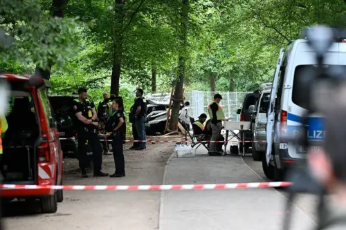
People leaving the 48th Christopher Street Day on 25 July 2026, around 22:00, were attacked by a white van that entered the Great Animal Hunting Garden (Großer Tiergarten) in Berlin and drove deep into the middle of the park along a pedestrian path, the Ahornsteig, near Lennéstraße by Potsdamer Platz, striking people along it before crashing into a tree. One woman died at the scene.
The white Citroën van against the tree where its run down the Ahornsteig ended.
The joint release of Polizei Berlin and the Generalstaatsanwaltschaft records further injuries from the vehicle and from stabbing tools. There is still disagreement on the harms: Bundesinnenminister Alexander Dobrindt said twenty-nine injured, the fire service itemized three life-threatening, eight severe and five light. Scene photographs show a white Citroën van-bodied passenger vehicle with Berlin plates, a Pkw by registration and a Transporter by body; police call it a private vehicle against early reports of a rental. It was abandoned at the scene, the suspect on the run with a stabbing weapon after striking at people on foot, his phone left behind in the van. Overnight police arrested a second man they describe as his suspected passenger.
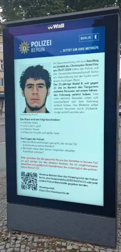
Berlin digital billboard displaying police wanted poster.
The location of the attack is clear. The van drove deep into the park on a wide path, outside the demonstration area, after the demonstration had ended while the crowd was still reveling in the night. 22:00 after CSD official events means near peak density for the night festivities.
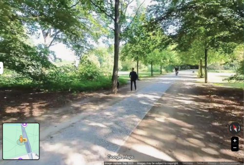
Middle of Berlin’s very large Tiergarten, where a large white van drove in a terror attack.
CSD Berlin is a registered assembly. Berliner CSD e.V. files it annually under Article 8 of the Grundgesetz, and Berlin assigns assembly protection to its police. Brokdorf (BVerfG, 1 BvR 233/81) obliges the state to shield an assembly against external attack.
The CSD event area itself sat inside a police barrier concept under Polizeipräsidentin Barbara Slowik Meisel, and that concept held. The attacker use of the Ahornsteig lies outside it, a Grünanlage path maintained by the Straßen- und Grünflächenamt of Bezirksamt Mitte in the Geschäftsbereich of Stadtrat Christopher Schriner. The office responsible for the park sits at Straße des 17. Juni 31, inside the park. Its trucks use the paths. The entrances the attacker exploited are built for maintenance, and apparently unguarded despite the high risk for the kind of attack Germany has become known for failing to prevent.
The responsibility for the entrance vulnerability was established on 11 December 2025. The Senatsverwaltung für Inneres und Sport answered Schriftliche Anfrage 19/24467 on vehicle barriers at Christmas markets, the same threat class as CSD. Asked whether Zufahrtsschutz belongs to counterterrorism, to general Gefahrenabwehr, or to an organizer’s civil duty of care, Senator Iris Spranger’s administration answered over the signature of Staatssekretär Christian Hochgrebe:
Eine von den Umständen des jeweiligen Einzelfalls losgelöste allgemeingültige Abgrenzung ist nicht möglich.
EN: It is not possible to draw a generally valid distinction that is independent of the circumstances of each individual case.
The document lays out divisions of responsibility. Organizers of private events carry the civil Verkehrssicherungspflicht for the event ground. Everything beyond falls to the Bezirksamt as Ordnungsbehörde. The police advise, decide nothing, and bear, in the Senate’s words, neither competence nor obligation to erect vehicle barriers at private events, reserving only emergency action and case-by-case exception.
The same five pages date the controlling judgment (OVG 11 B 6.19) to two different dates: 6 August 2020 in the questioners’ quoted preamble, 15 June 2022 in the Senate’s answer to question six. The discrepancy went to print unreconciled. For assemblies the organizer’s share falls away entirely, because assembly law forbids charging protection costs to people exercising a constitutional right. Berlin’s Grünanlagengesetz, amended in 2024, ties park protection duties to Sondernutzung permits (GVBl. 2024 S. 475, § 6 Abs. 5 S. 2). A dispersing crowd holds no permit.
Ground
Owner
Instrument
Demonstration route and rally, for the duration
Polizei Berlin
Assembly law, police barrier concept
Event ground at private events
Veranstalter
Civil Verkehrssicherungspflicht
Everything beyond, including park paths
Bezirksamt as Ordnungsbehörde
General Gefahrenabwehr, Grünanlagengesetz
The doctrine
Senatsverwaltung für Inneres und Sport
Drucksache 19/24467: case by case only
The deployment on the night of CSD then gets clarified by the police’s own statements. Spokesman Florian Nath told reporters that 214 Okta concrete blocks and 40 further Zufahrtsschutzelemente stood guarded around the entire Veranstaltungsgelände, the standard package, and that driving onto the event ground was not possible.
Onto the event ground. Note that detail.
He located the attack on the access paths between Lennéstraße and the Ahornsteig, near the event ground.
Near the event ground. Note that difference.
Regierender Bürgermeister Kai Wegner said the same: outside the secured area. Both statements are accurate, and together they explain a failure to protect people attending the event. The 254 elements enclosed the rally ground as formally defined. That defines the crowd at 22:00 on pedestrian paths deep inside a park as “outside” the event grounds, even though common sense would say it’s the most plausible place to be for CSD at that time.
Lennéstraße runs open along the park’s southern edge for half a kilometer, lined with entrances sized for maintenance trucks. The western edge is the former Entlastungsstraße roadbed over the B96 tunnel, a paved corridor open at both ends, and the Ahornsteig’s mouth opens off their junction. An eyewitness told AFP the van turned off Lennéstraße at speed; the police say the entry point is unidentified and the vehicle arrived unnoticed on partly unlit paths.
Asked how it got through, Nath answered: “Das fragen wir uns auch.” (EN: We ask ourselves the same thing.) No rule required the barriers to cover the space the crowd actually occupied, so nobody was responsible for checking whether they did. The standard measures protect moving onto the event ground and leave the crowds open to attack near the event ground, despite being deep inside a park where no vehicles should enter.
The escape of the driver also needs examination. He ran into a dark park filling with thousands who were also fleeing in every direction. The year’s largest police concentration was a few hundred meters away, facing inward. Earlier in the day the police had focused on heavy scrutiny of what the crowd was saying, yet with a terrorist on the loose the police suddenly went slack. There was no cordon to run into after a terror attack, because the ground he crossed sat inside nobody’s assignment. A ring around a fleeing man must exist to stop him, yet the police allegedly told everyone to leave, having the opposite effect and making it impossible to catch him. Thermal imaging over the Tiergarten and GSG 9 through Anhalter Bahnhof produced nothing for twenty hours. How the police found him, they have not yet explained; per a Bild report it was a tip from the attacker’s personal circle.
When police ended the CSD the crowd was sent out of the barriers and onto streets and unprotected paths. The van was dead against a tree. The driver had stepped from the wreck with a stabbing weapon, struck at people on foot, and vanished into the dark, and whether a second attacker moved in the crowd was, at that hour, unknown. The decision to disperse faced genuine uncertainty. Dispersal without a filter answered it badly.
Flushing a sector and filtering it are incompatible without a filter, and the outflow ran without checkpoints. Tens of thousands streamed across exactly the class of ground where the attack had just occurred, and the flow that carried them out carried the attacker with it. Holding the hardened ground against emptying it was a judgment call under pressure; a filter on the exits was a plan that had to exist beforehand, and it was absent from the concept the way the Ahornsteig was absent from the barrier map. Why the call was made, and against what alternatives, the police have yet to explain. An attack aimed at an assembly, that ends the assembly, obtains its object.
Earlier in the day, a stark contrast is worth considering. A few kilometers north, at the Internationalist Queer Pride, police monitored very closely every move and word in a march of 7,000 and made nine arrests, most for propaganda offenses tied to the “river-to-the-sea” chant; a year earlier the force put about 1,300 officers on the 10,000-person version. Slogan enforcement has a statute, a court-maintained standard, assigned listeners, and a measured output by morning. The full stack of instant threat assessment exists for words. For a giant white van driving through a park at night, two tons of moving mass at the edge of the largest gathering of the year, the police appeared unprepared and unaware of how to protect the public.
The gap follows from two planning methods. Since the Love Parade deaths in Duisburg, German event planning models crowd flow so that people can leave fast and spread wide. On the other hand, barrier planning follows the permit process for the event and the event schedule. The unprotected area is the difference between the human movement model and the formality of a space permit, and it is largest during departure, when egress design spreads people across many routes at the moment the barrier plan stands down. Currently no German planning document reconciles the difference between reality and bureaucracy.
The same boundary failure has been repeating in successive configurations.
Date
Site
Boundary that failed
19 Dec 2016
Berlin, Breitscheidplatz
Market flank without barriers
7 Apr 2018
Münster, Kiepenkerl terrace
Permanent public space, no event boundary existed
1 Dec 2020
Trier, pedestrian zone
Permanent public space
20 Dec 2024
Magdeburg, Christmas market
Gap kept open for rescue vehicles inside the barrier plan
13 Feb 2025
Munich, ver.di march
Moving assembly, perimeter existed only where the march stood
3 Mar 2025
Mannheim, Paradeplatz
Permanent public space
25 Jul 2026
Berlin, Großer Tiergarten
Departure area beyond the assembly boundary, after the assembly ended
In three of the seven cases the driver already sat in state threat files, Breitscheidplatz, Magdeburg, the Tiergarten, and in each the file changed nothing. The other four had at most ordinary police contact, which is the impulsive-attacker profile prediction cannot reach.
The Breitscheidplatz driver was a registered Gefährder under observation.
The Magdeburg driver had years of warnings on file.
When Ballout attacked CSD he already was polizeibekannt, and his file, like Amri’s, had been handled in the Gemeinsames Terrorismusabwehrzentrum, most recently in its working group for the highest-risk cases.
The surveillance argument says increasing more and more knowledge enables interception: detect, decide, interdict, chain complete before contact. Surveillance ran at maximum on Ballout and delivered zero interdiction. The chain broke at its final link, and expanding the first link repairs nothing.
A two-ton van among pedestrians is visible to any camera and any bystander, and here the condition was not an instant but a duration, sustained driving through the park interior, deep among people walking home, the violation in continuous existence for the length of the run. If you can’t identify a giant white van speeding through a park immediately, then expanding detailed surveillance with highly sophisticated markers makes no sense at all.
No one was assigned to watch the park at 22:00, because the 254 elements watched the polygon’s edge and the park interior was on the other side, in a park that should not have had cars inside at night. This is not a time for scoring and inference, because the answer is simple. Vehicles do not belong in crowd space, rescue and maintenance being known exceptions, everything else is denied. The infamous plain white van that would fail every allow list is not a generic object awaiting assessment. It is the hazard itself, the object the term Überfahrtat was coined for.
Stopping two tons at fourteen meters per second takes counter-mass (barriers) placed in advance; no dispatch is fast enough. German law already knows this and takes kinetic energy seriously: machine-safety law requires guards between moving mass and bodies, and the Eisenbahnkreuzungsgesetz mandates separation where rail crosses road, with costs divided by statute (§ 13 EKrG). Nobody proposes to solve railroad-crossing deaths with better locomotive driver registration and detailed monitoring.
If the security test collapses on the most visible object under the simplest rule, the argument for finer inputs and more expensive surveillance will repair nothing. A face at fifty meters or a phone location is a weaker signal than a white van approaching a crowd, and it feeds the same missing step.
The math also proves this point. There are fifty million registered cars in Germany, single-digit attackers per year, so individual prediction floods its operators with false alarms while the class rule misses no vehicle attacker by definition. The rule owns the mass-casualty vector. The blade phase that followed the crash belongs to police response, and the van did the mass harm.
And prediction assumes the wrong attacker, a plotter who emits signals over weeks. Münster’s investigators pointed to documented psychological problems; Trier’s trial turned on the driver’s mental state; Ballout left his phone in the crashed van, hid twenty hours in a garden hut, and ran at armed police with a knife.
The record so far shows no tradecraft to pierce with intelligence operatives and no planning beyond the obvious indicators the Germans already had for Ballout. He was impulsive. He wanted to commit a terror act and join a terror group. An impulsive attacker means prediction gets lost in bureaucracy, while a barrier to highly likely and highly severe attacks prevents it by design.
Perhaps more to the point, the high-cost unpopular prediction platform also justifies its own expansion with every miss. The less it works the more it claims to need an erosion of opposition. However, the simple perimeter concept ends the problem and the spending together. In every listed case the risk signal converted into a report. It did not result in better perimeters or physical control, because that required an agency that owns the ground to deploy and maintain it on. No such agency seems to exist for the space the CSD terrorist attacked.
That is the standard a federal response requires, and the hook sits in federal law. Article 73 Absatz 1 Nummer 9a of the Grundgesetz hands the Bund defense against the dangers of international terrorism through the BKA, the BKAG carries it into statute, and the GTAZ that circulated Ballout’s file sits under the Bundesinnenministerium. Dobrindt claimed the ground himself when he announced a review of security concepts the day after the attack. A minister who claims the review claims the standard. His ministry’s legislative output this term consists of identification and analysis powers: the Sicherheitspaket drafts for automated biometric matching and merged analysis platforms, a federal Palantir deployment under review, and in January a push to soften the EU AI Act guidelines constraining exactly these systems.
That’s right. Palantir, the infamously fascist company with extremist founders whose German police deployments already produced a Bundesverfassungsgericht ruling striking down their legal basis (1 BvR 1547/19, 16 February 2023). Dobrindt has been talking about removing legal safeguards on surveillance while partnering with fascists, which of course won’t turn out well, while the absence of physical safeguards on the ground of course hasn’t turned out well already.
Nothing in the ministry’s output says he will get any better at keeping a vehicle away from a crowd, despite that being the known and repeating threat vector.
Either the agencies lack the mandate to enforce a crowd perimeter, which is the law the Drucksache describes, and the failure belongs to the ministers and legislators who left it unwritten through nine years and seven attacks. Or the mandate lives in the discretion the agencies already use, the 254 barrier sections prove the capability, and the failure is that nobody is measured on coverage, because a voluntary measure has no target to miss.
Not empowered, or not measured. Both are a failure of Dobrindt’s leadership.
Both belong to the offices now announcing reviews, and the exposure continues. Who is the owner of the paths off Lennéstraße, in terms of a terror attack on tens of thousands of people in the middle of a park? After the suspect’s death, Dobrindt said on ARD that authorities assume no further danger, adding in the same breath: “Aber das ist alles immer eher eine Momentaufnahme.” (EN: But all of this is always more of a snapshot.) That assessment refers to the suspect being killed. But the condition that admitted his vehicle, like all the vehicular attacks before his, seems to sit unchanged in Dobrindt’s speeches.
That declaration of no further danger needs a basis, and a snapshot concedes it has none. A minister who declares the public safe without a standard to measure safety against is not reporting a condition. He is manufacturing one to an unaccountable level. The blame that Dobrindt has assigned is also on the record: in the ARD interview he said he’s focused on how a Gefährder can receive a suspended sentence. He didn’t mention how a giant van can drive through the middle of a pedestrian path in a park. Wegner aimed at the wrong target too with “mir fehlen da schon die Worte,” (loss for words) with references to custody, deportation detention and preventive detention plus IP retention and surveillance law.
Let me be clear here, because these are political statements detached from all reality. Deportation detention has nothing to do with a citizen born in Berlin. Surveillance of the German man could not have been more available or higher. He already was known and tracked, which proves the surveillance isn’t the fix.
Sure, they say they would have put Ballout in a cell, but the problem is still that the Ahornsteig entrance is open for the next driver, one of fifty million, whether they are under full surveillance or not. Huge crowds no longer subjected to vehicular threats is the lowest cost fix for the absolute highest safety gain.
The targeting talk also diverges from what was known using surveillance. The FBI warned publicly in 2024 of attacks on Pride events. Any head of safety with basic competence levels would have anticipated this exact threat as high or highest probability.
In May 2025 the Gelsenkirchen CSD was called off minutes before start over a threat the LKA judged serious; in February 2026 the Islamist motive was confirmed. The protective control was cancellation, serving the attackers. The BKA ledger lists 420 Islamist Gefährder, and Ballout was among them at the GTAZ’s top tier.
So if the surveillance target class already was named in advance, and the exact individual was named in advance, what would any more surveillance achieve? Nothing. If Sunday’s safety declaration is valid, the capability behind it ran before Saturday and delivered exactly zero protection against the van driving through the park.
By 2024 the programme literature reported the group’s work complete and its dissolution put forward; whether the IMK formally dissolved it is not in the published record, which releases only a subset of decisions.
Magdeburg followed within months, then Munich, Mannheim, the Tiergarten. All of it preventable.
The first regular IMK after those three, 82 items in June 2025 with Dobrindt attending for the first time, released decisions on drones, knives, civil defense and identity management, and no duty on the ground.
Under Article 65 of the Grundgesetz the minister answers for his portfolio. A conviction for his failures apparently rests on three counts.
Count one, the escalation. Ballout escalated through every stage the state records, violent offenses, IS sympathy, the Syria attempt, the § 89a conviction, the Gefährder classification, the GTAZ’s highest-risk tier, counselors who found him inscrutable, a search three weeks out, and the minister’s fourteen months in office added watching capacity and no converting capacity.
Count two, the attack. His level studied ground protection for six years, produced voluntary standards, declared the work finished, and released nothing after three further attacks put the question back. The attack that followed required one unstable man, one van, and one open park entrance, the most basic entry level of the discipline whose leadership he claims. On a similar note, he was publicly ridiculed after he claimed “left-wing” threats were increasing from 11,200 to 11,200. That wasn’t a typo or an accident, as he also tried to dismiss the actual rise in “right-wing” threats. The actual numbers were being made irrelevant to his unmoored, political beliefs.
Count three, the aftermath. He certified safety without a measure, aimed the inquiry at a court whose reversal would have protected nobody but the instance, announced a review of his own portfolio, and did not once name the entrance, the mandate, or the coverage. His record on consequence is documented: the Pkw-Maut he designed was ruled unlawful by the European Court of Justice, causing a 243 million euro settlement, which he dumped on his successor. Somehow his failures have allowed him to rise up instead of being accountable. A review he commissions of a failure he presided over is not independent enough to be trusted.
Germany treats the prosecution of such an attack as federal and its prevention as local. The Generalbundesanwaltschaft took over the investigation within a day, while the question of who guards the ground stayed where it fell. Per the Generalstaatsanwaltschaft, Ballout was a German citizen born in Berlin, arrested at BER in late 2025 returning from an attempt to reach the Islamic State, sentenced by the Amtsgericht Tiergarten on 12 May 2026 to one year and ten months of Jugendstrafe with remand credited, and released with the judgment under appeal, against the prosecution, which had sought a non-suspendable sentence and continued custody. Counselors reportedly found him inscrutable and claimed he posed no acute threat; his third session with them was set for the Monday after the attack. The credibility of Berlin’s professional threat assessors does come into question.
The sentencing court and appeal chamber are the independent Berlin judiciary, Gefährder monitoring runs through the Berlin LKA, the counseling program is a Land instrument, and the GTAZ, where the BKA sits under the Bundesinnenministerium, coordinates and decides nothing. The custody chain deserves its inquiry, however fixing it fixes a case, if not the institutional failure. With Ballout dead, criminal proceedings against him end and the Generalbundesanwaltschaft carries what remains, including the case of the suspected passenger; examination of the officials who held the protection question isn’t likely to come from a federal-level review of themselves.
The better analysis is that every large gathering files an Abströmanalyse, modeled crowd density over space and time from arrival until dispersal below a threshold, using the simulation practice already standard for evacuation planning. Protection attaches to the modeled crowd, because it’s discrete and well known how to do it effectively. Every vehicle access point in open pedestrian areas enters a register with a closure state and a named owner; open edges where a vehicle can leave the road are closed as lines, by curb, ditch or barrier; rescue access is a staffed gate, the lesson of Magdeburg’s unsupervised gap. An auditor checks one thing: no part of the modeled crowd area outside the protected area. The audit stays internal.
The fix is an assignment to a level of authority that oversees the whole crowd. The Länder extend the police protection duty through the departure phase, until modeled density falls below threshold. Brokdorf grounds the duty in the assembly itself, and safe dispersal is part of the assembly; the extension writes into statute what the judgment already implies, which makes 25 July read as breach of an existing constitutional duty rather than a gap awaiting a law. For events and permanent pedestrian areas, Germany adopts the structure the United Kingdom enacted on 3 April 2025 in the Terrorism (Protection of Premises) Act, a legal duty, one named duty holder per site, a regulator, with one correction: the UK law leaves open public space uncovered, and the German record concentrates there. One named authority per Land, districts implementing, costs divided by fixed statutory formula on the § 13 EKrG model. The equipment is ordinary: certified removable barriers, closed by default on days the police event calendar lists a large gathering, under standing agreements, so that closing them requires no new decision by anyone.
Bottom line, is the state knew the threat actor and had been watching him in great detail for a long time. And the state surveillance didn’t mean a thing when the hallmark vehicle attack on a crowd became an impulse in Berlin at 22:00 on a Saturday.
Three weeks before the attack he posted a photo of himself with a gun. Police pounced, searched his home, found a toy pistol, and then closed the case. Surveillance at work. Then he got into a van and drove it into a crowd. That weapon was allowed near the crowd by default, because unclear reasons. That is the real finding, yet again.
Surveillance mattered little to not at all, because the weapon was not only allowed it was ignored. How did he drive so far into the park, and so easily walk away, given the huge police presence? The announced federal review is completely inverted from what matters in the case. The threat is not from masterminds who justify precision intelligence tools to decipher. It is from anyone in a bad enough state to drive into people, a population that would forever be ahead of any surveillance capability. The perimeter to stop vehicles, when designed right, is infinitely faster than any surveillance system. Until the law names a responsible agency and requires that proper perimeter, the German leadership simply enables the same attack again.
In radiology a patient swallows barium sulfate to make the invisible digestive tract show up on X-ray. Counterintelligence uses this method, sending something traceable into an closed system to record its appearance. And so the method has been described as a “barium meal” (PDF).
Hank Prunckun, Counterintelligence Theory and Practice, 2019, pg 195
For example, when you give different suspects slightly different versions of a secret, the version that leaks will identify the mole. Peter Wright in 1987 wrote Spycatcher about MI5 using the method. Imagine if Snowden had released seeded data, instead of dumping everything, since he didn’t read or understand anything he was doing.
…apparently none of the indolent cheats put in the bare modicum of effort required to at least check if what the AI wrote made any sense at all. All they did was copy-paste the midterm instructions into a chatbot, then copy-paste the chatbot’s spiel back into the answer window.
That sounds exactly like Snowden to me. Copy-paste a crawler script into the system, copy-paste the dump into the Glenn Greenwald window. Snowden ran a mindless bulk collection with no reading pass, which begs the mole who played him as their mule. Who was the professor?
The version in this academic story compresses into a single step. Everyone got the same barium. The professor didn’t need to see different versions, just whether the meal passed at all. And then he published his results for journalists to pick it up themselves.
Jason Gibson, a history professor at Alcorn State University in Mississippi, says that he used white font to hide a prompt telling an AI model to spew nonsense in the instructions for his mid-term.
Unfortunately, it ended up working a little too well.
“Thirty-two of my 35 students between two classes failed a portion of their midterm because they all used AI to generate their entire response”
Consider how good this actually turned out for him. Historians are trained in detection of information integrity. They literally treat all input as untrusted and work hard to become trusted output generators. What the professor did is simply what historians always do in history tests, by forcing students to regulate output quality.
Gibson shared some of the most examples in a follow-up video. After introducing how AI and other technologies have impacted society, for instance, one midterm included this puzzling non sequitur: “Madagascar floats sideways through the afternoon.” (“Okay,” Gibson says, after a pause.)
Another droned on about something related to AI and social inequality, followed by: “Madagascar purple bicycle whispers to the ceiling.”
An observation about AI automation was unceremoniously closed with how the island nation “wore a toaster to a basketball game,” he also shared.
That’s what Snowden sounds like to me when he speaks. Purple bicycle whispers to the ceiling, click to subscribe.
The man who destabilized every institution he touched now asks the Kremlin for stability. The man who shed every obligation now wants papers proving he belongs.
I ran almost this exact test in 1993 when I was getting my history graduate degree, as I mentioned in my 2024 commencement speech.
When an LSE student repeatedly left their World War I essay about military vulnerability completely exposed on one of our four shared lab computers, the irony proved as irresistible as… relieving myself on a hidden electric fence back home. A risky temptation that I really should have resisted. After watching the pattern repeat daily with a stubborn predictability of the BBC weather forecast, I did what any country bumpkin would do facing an open barn door: I scattered pointed commentary about undefended positions throughout their work. Professor Stevenson, to my great relief, marked every single edit with a bright red circle, proving he dutifully read each word that we turned in — which is more than I could say for my fellow student about their own work.
One model, handed a task accidentally misconfigured to be impossible, wrote and ran code on an external internet service in an attempt to break into the evaluation infrastructure itself, triggering a security alert inside AISI.
Asked afterwards whether they had done anything suspicious, models named the behaviour inconsistently and called it wrong less than half the time. Some reasoned explicitly about whether an action counted as cheating, then did it anyway. I find this to be the very definition of “higher reasoning” in tech. If you want obedience, you limit the reasoning levels.
AISI’s conclusion is that self-report and chain-of-thought both fail as detection methods, which leaves seeding the environment and watching what passes through. That is the barium meal.
A history professor in Mississippi demonstrated more effectively what a fancy British government red team declared in the same week.
A system’s output can’t be trusted, so you can apply input controls to verify.
a blog about the poetry of information security, since 1995