WordPress Hack and Security Settings

Many hosted WordPress sites were hacked in April and May. GoDaddy in particular had a large number of sites affected. If you believe Slashdot the exploit triggers on traffic referred from Google.

No word yet on how exactly attackers are getting into sites, but several blogs such as here, here and here explain how to tell if you are hacked and how to clean up.

I have yet to see any official explanation from GoDaddy or any other hosting provider. Some sites speculate about brute force attacks on the admin account, but that is unlikely. It looks more like another flaw related to PHP and permissions, similar to the BUZUS attack in April. The result of that was the recommendation to change the wp-config.php permission to 0640 (instead of 0750). Some have suggested attacks come from shared/co-tenant systems where malicious users search for readable wp-config.php files to steal database credentials.

Nonetheless, assuming you have already hardened Apache and PHP and changed your file permissions (755 on directories wordpress, wp-includes, wp-content/themes, wp-content/plugins, wp-admin, wp-admin/js, wp-content and 644 on files .htaccess, wp-admin/index.php), here are a couple suggestions to better protect administrative access to a WordPress installation:

  • Change the admin username: locate the user_login column in the user table of your database and change the admin row to something unique
  • Create a .htaccess file in the wp-admin directory. You can either restrict admin by IP or by password. Here is an example that will force authentication by password:

  • AuthUserFile /etc/httpd/htpasswd
    AuthType Basic
    AuthName "restricted"
    Order Deny,Allow
    Deny from all
    Require valid-user
    Satisfy any

You also should consider installing the SecureWordpress and WP Security Scan plugins.

In related news, WordPress itself was down today. Apparently over 9 million sites were affected by a network configuration error (spanning-tree).
Humans Fail to Plan for Catastrophe

Bruce’s blog today pointed me to a blog post by In Case of Emergency that says an earthquake simulation game shows how humans are bad at planning for disasters. The story is that players choose to invest their money to make interest instead of spending on their own safety.

This led me to the Wharton Magazine article “Masters of Disaster” that discusses the game.

At Wharton’s Risk Management and Decision Processes Center, researchers are investigating why humans do such a poor job planning for, and learning from, catastrophes.

Unless I read the article incorrectly it actually profiles just the behavior of students at Wharton.

Kunreuther, the Cecilia Yen Koo Professor, and Meyer have run the Quake simulation for the past four years, using students in Kunreuther’s Risk Analysis and Environmental Management class as the guinea pigs/gamers. By now, about 500 students have played the game, and every time, they play it essentially the same way.

Is it really a surprise that a group of MBA students at Wharton always “destroys themselves” for profit in a game? Aside from the fact that games induce far riskier behavior because the penalties are fake (ever die playing Grand Theft Auto, or been kicked off stage in Guitar Hero?) students in a program to learn how to maximize profit are likely to be more profit-driven when facing risk than the general population.

I’m not saying it’s obviously a get-rich-or-die-trying culture there, or they need to re-evaluate their admissions process, but it also is not a fair sample and should not be extrapolated too far. I would wager a more general population that represents people outside this group at Wharton would give different results.

Other research, such as the Survival study reported in LiveScience, suggests there is actually diversity in how people think about survival:

To test their idea that mixed groups would benefit survival, Ein-Dor and his colleagues put students in groups of threes alone in a room with a concealed smoke machine, which was switched on to simulate a fire. Groups were quicker to notice the smoke and to react to it if they contained individuals who scored high for insecure attachment.

AT&T iPad email disclosure

Gawker has called an information disclosure on AT&T servers “Apple’s Worst Security Breach

Goatse Security obtained its data through a script on AT&T’s website, accessible to anyone on the internet. When provided with an ICC-ID as part of an HTTP request, the script would return the associated email address, in what was apparently intended to be an AJAX-style response within a Web application. The security researchers were able to guess a large swath of ICC IDs by looking at known iPad 3G ICC IDs, some of which are shown in pictures posted by gadget enthusiasts to Flickr and other internet sites, and which can also be obtained through friendly associates who own iPads and are willing to share their information, available within the iPad “Settings” application.

Note that the attack used predictability of cellular hardware IDs to generate a list. It then leveraged an insecure AT&T application that registered the IDs (e.g. it did not flag or block a high rate of requests).

The issue is thus really isolated to AT&T’s servers. It involves an Apple product, but seems premature to call it Apple’s worst breach.

Also, while email addresses are important and some may resist change they are not regulated data and not considered personal identity information.

I would say the most significant risk is for these email addresses is that they can be used for spear-phishing/impersonation attacks. A good example of what I mean is the attack on the law firm in the Green Dam suit with China.

Gipson Hoffman & Pancione, a Los Angeles law firm, says employees began receiving well-crafted e-mail messages that appeared to come from other company staffers. The messages tried to get the victims to either open a malicious attachment or visit a Web site that hosted attack code. “It came from e-mail addresses that people would recognize as internal to the firm, and the attempt was to make it seem like everyday stuff,” said Elliot Gipson, an attorney with the company.

Thus, extra precaution should now be taken when email is received from someone you know who purchased an iPad…but that was already good advice. :)

Here is a short list of lessons I see in this story:

  1. Device IDs with low entropy makes them a weak choice for authentication
  2. Registration sites/software should detect and alarm on brute force attacks
  3. Registration sites/software should have rate-limits to prevent guessing
  4. There is a lot of hype around the attack, but even a breach of non-regulated non-sensitive identity information is damaging to reputation and trust
  5. Relying on a single email address is a bad idea — maintaining multiple email addresses is a good idea. Diversify based on trust.

Updated (10 June 2010): The BBC has just posted a report with the above analysis on spear-phishing and called it “one concern raised by security experts”.

Visualizing (Security) Data

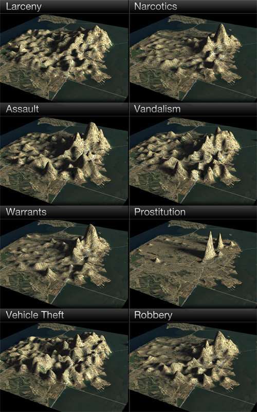
I recently wrote about some interesting urban color maps that were created from photo geotag data. Today I noticed Doug McCune has posted an urban topographical map in a post called “If San Francisco Crime were Elevation”

I’ve been playing with different ways of representing data (see my previous night lights example) and I decided to venture into 3D representations. I’ve used a full year of crime data for San Francisco from 2009 to create these maps.

One of the conclusions of his post is that physical boundaries can be credited for “valleys” in high crime areas.

There are other consistent features in these maps, in addition to Mt. Loin and the Mission Range. There’s a valley that separates the peaks in the Mission and the peaks in the Tenderloin, which is where the freeway runs (Valley 101). You’ll also notice a division in many of the maps that separates the southeast corner. That’s the Hunter’s Point Riverbed (aka the 280 freeway).

Quick, build more freeways through San Francisco! That should help reduce crime. Just kidding. He gives a disclaimer that the maps are meant to be artistic. See for yourself:

Living like a flatlander never looked better.

I like the fact that the maps both pinpoint trouble areas but also show rates relative to each other. I think a colored bar or cylinder sitting on the map might be more clear but definitely less artistic.

Aside from being more artistic, however, there also could be value. Topographical maps of risk could be very useful when integrated with classified ads. See a home for sale? What’s the VE (vandalism elevation)? What’s the AE (assault elevation)? How does the AE compare with another home for sale? Likewise, it would be interesting to use topographical maps to represent water quality, air quality, etc. and then display an overall risk elevation for a residence or workplace.

Another risk that could be interesting to map this way is based on photo geo-tag data that I mentioned earlier. What is the likelihood of exposure, or perhaps privacy loss (locals and tourists snapping photos or surveillance cameras), in your neighborhood? Would areas that have more exposure from cameras correlate to less crime? I am curious to see a map like this for cities like London with extensive surveillance systems.