Three researchers at the École polytechnique fédérale de Lausanne (EPFL) — Pedro C. Pinto, Patrick Thiran, and Martin Vetterli — have published a paper called “Locating the Source of Diffusion in Large-Scale Networks” that echoes the principle I presented on six months ago at RSA USA 2012:
How can we localize the source of diffusion in a complex network? Due to the tremendous size of many real networks — such as the Internet or the human social graph — it is usually infeasible to observe the state of all nodes in a network. We show that it is fundamentally possible to estimate the location of the source from measurements collected by sparsely-placed observers. We present a strategy that is optimal for arbitrary trees, achieving maximum probability of correct localization.
Following a common model in nature and science, with a nod to epidemiology as I suggested in my presentation, the authors propose an algorithm for using a highly reduced set of nodes in order to calculate source. In other words we don’t need to wait for data from every single end-point (100% infection) to find the source of an attack.
Here is the slide from my presentation at RSA Conference USA 2012 “Message in a Bottle: Finding Hope in a Sea of Security Breach Data”
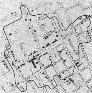
As I explained at RSA we can easily leverage the insight of Dr. John Snow’s map-based spatial analysis and algorithm (voronoi diagram) to find the source of attackers.
Measuring relationships (and the lack of relationships) creates clarity in finding sources. Steven Johnson, author of The Ghost Map, tells a colorful story of how it happened in the 1843 epidemic.
Back to the map itself and some fun math, Plus Magazine offers the following explanation of how a Voronoi Diagram/Thiessen Polygon can be used find influence of a specific point.
[Dr. Snow’s] next ingenious step was to represent the time it took to travel to the Broad Street pump on his map and to calculate who was most likely to use each water pump in the area. Snow drew a curve on the map that marked the points where the Broad Street pump was at equal walking distance from neighbouring water pumps. If you live inside this curve the Broad Street pump is your nearest source of water. Almost all the deaths marked on the map lay inside this curve and anecdotal evidence explained the few cases that did not.
Michael Friendly offers this animated version of the map, which ends with the bright blue lines of a Voroni Diagram.
Of course Snow’s work is a major and well-known influence in all areas of science. However, in my extensive research from 2008-2011 on breach data and source location, I did not find any prior presentation or publication that suggested using Snow’s approach to solve attack source location in network security. That was exactly my point in presenting it in early 2012 and trying to draw attention in the RSA audience to solutions we can build based on a study of risk characteristics, causes and influences (epidemiology).
For comparison, here is a figure from the CLEP paper that was just released, which shows an estimated attack source location based on nearby yet “sparse” observations:
You could read that map as red for the water pump and green for each person infected by contaminated water. They say they are focused on “inferring the original source of diffusion, given the infection data gathered at some of the nodes in the network”. That sounds like Dr. Snow.
Moreover, their paper actually references a modern cholera outbreak to illustrate their theory; a figure in the paper is of “infected nodes” among “associated water reservoirs” almost exactly like the methods pioneered by Dr. Snow.
With all the obvious similarities, however, they make no mention of my RSA presentation regarding investigation of security breaches and even more shocking is an absence of any reference to the legacy of Dr. Snow.
Please note I will give an updated version of my presentation at the end of this month at RSA China 2012. Here’s a highly abridged version of my presentation produced by the RSA Conference last February:


