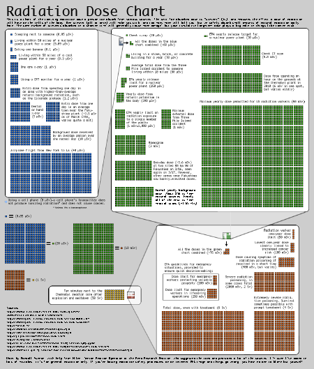
xkcd has a dry wit and usually a good sense of how to fit humor with technology. The radiation dose chart on the site is a great idea but it lacks cartooning and jokes. Is that because of sensitivity, fear and feelings associated with radiation exposure?
He points out, for example, that a CRT over one year will expose you to more radiation than an x-ray of your arm. Maybe I should put that the other way around. It’s kind of funny.
The giant green box area on the right side of his chart is the maximum annual dose allowed a radiation worker, while the itty bitty green box to the left of it is the maximum external dose from Three Mile Island. Wow, assuming his boxes are accurate, good illustration on risk.
The BBC offers a more dramatic version. They list the levels in numeric format, but the chart gives a very “red” heavy impression of exposure. I noted in their chart that the annual dose level allowed a radiation worker has been reduced by more than half. This suggests that these charts are not an accurate representation of known risk — they are an estimation still subject to change.
Of course photos of radiation victims probably have the most profound effect on our risk thermostat, as they tend to give us a sense of accurate representation (7 million affected by Chernobyl fallout, half of them children instead of just the 50 officially recorded).


One thought on “The Risk of Radiation Dosage, Illustrated”